The phrase “Best Design Trends” didn’t feel quite right to me, nor did “New Design Trends.” Many of these trends either extend from the previous year or even from years before that. This makes writing about design trends somewhat tricky or perhaps not entirely accurate. On the one hand, there are no strict rules for trends, so it’s difficult to say, “These are the only current trends.” On the other hand, some trends are constantly evolving.
That being said, after nearly a month into the new year, here are some of the current design trends. As usual, these observations are based on personal insights.
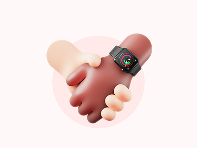
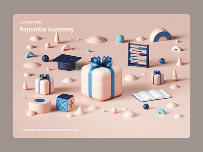
3D Tactile Design
This trend, also known as “3D Tactile Design,” has a texture that makes you want to reach out and touch it. While it’s not a new trend, Apple’s incorporation of it into the icons of the new MacOS has brought it back into the spotlight. This approach feels like a blend between the previous flat, colorful style and the early 3D designs of the first iPhones—a style I still love to this day. Another reason this trend is likely to continue developing over the coming years is the rise of Augmented Reality (AR) and Virtual Reality (VR), which will probably lead to a significant increase in the use of 3D elements in both physical and digital environments.
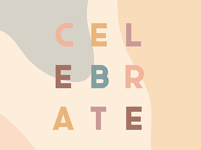
Muted Color Palettes
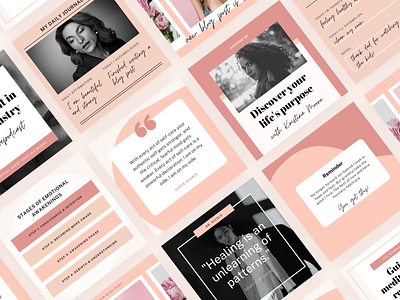
The muted color palette trend, which emerged last year, is likely to remain popular for some time. This trend is characterized by its simplicity and visual comfort, offering a balance between modernity, longevity, and low risk. Whether in logos, user interfaces, or print materials, this style is eye-catching and constantly evolving. For example, in “Dark Mode” designs, muted colors are often enhanced with darker shades instead of being toned down, maintaining the palette’s understated look while adapting to the dark environment. Overall, this trend is visually appealing and is expected to gain more traction in the near future.
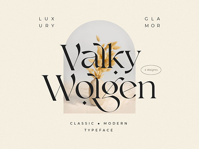
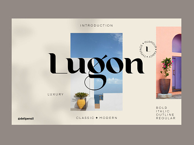
Classic Fonts
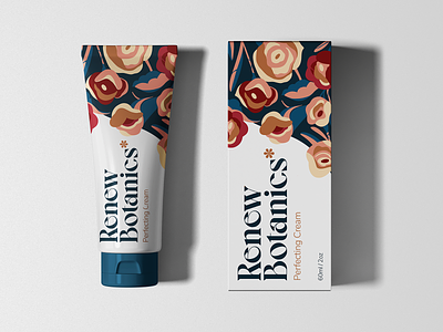
A noticeable trend is the resurgence of classic fonts, like Serif and its derivatives, or even fonts that build on these styles, such as those used by Mailchimp. This trend is gaining popularity, especially when combined with the previous trend of muted colors, resulting in fresh and attractive designs across various mediums. If I had to choose a trend to focus on this year, it would be this one along with muted colors, as they offer a lot of potential for creative application.
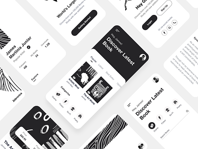
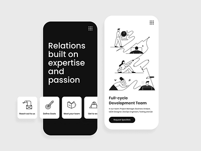
Colorless Style
This trend can be seen as an extension or evolution of the “Dark Mode” trend, which gained widespread popularity recently. If you follow this trend closely, you’ll notice an increasing use of purely black and white interfaces, sometimes with one or two accent colors. This style started last year, particularly in certain types of apps, such as those for writing, journaling, or those focused on meditation and mental clarity.
Social Slides
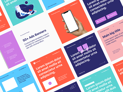
The idea of splitting images into carousel slides on Instagram has led to the rise of the “Social Slides” trend. This trend became widespread last year, with some accounts fully dedicated to slide-based content, ranging from information sharing to cultural commentary. While some uses of this trend are mundane, companies like Zoom have used it in a stylish and appropriate manner. This trend has evolved from being an Instagram feature to becoming a clear design trend, likely to persist for some time before either fading away or further evolving.
Floral Design
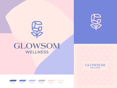
Earthy tones, natural gradients, leaves, and flowers intertwined—this is a trend that has made a comeback. It aligns well with the simplicity embodied in recent design trends, and it’s visually striking, creating a sense of calm and familiarity. All these aspects make it a harmonious trend, and from a philosophical perspective, one could say it’s a natural human response to the restrictions we’ve faced during the COVID-19 pandemic.
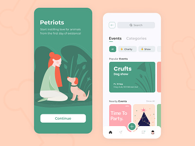
Illustrations
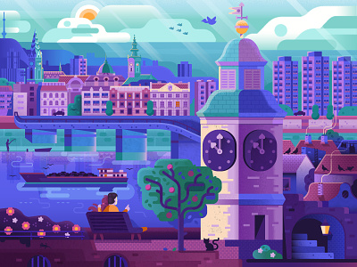
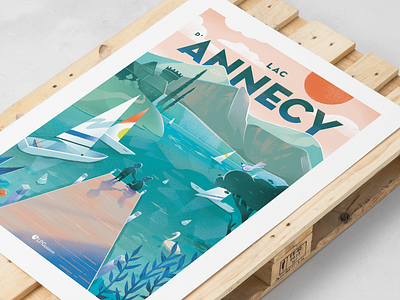
Illustrations have become a staple in design trends, evolving beautifully from the flat designs of the past to incorporate shadows and textures. Procreate, for example, has played a significant role in driving this evolution. It’s a natural progression, especially with the increasing focus on 3D elements in design. One of my favorite recent applications of this trend is framing cityscapes or specific scenes within a closed shape, as seen in the images I’ve shared above.
Other Noteworthy Trends
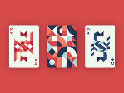
Other trends worth mentioning include Abstract Shapes, which are widely used in print materials, packaging, and even in user interfaces. This trend is visually appealing, long-lasting, and has become a staple in modern design. An emerging use of this trend is incorporating abstract shapes into logos, not just in brand identity elements but in the logo itself.
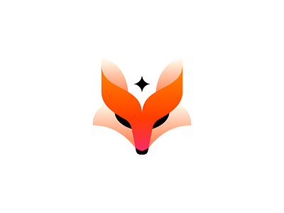
Another trend to watch is Geometric Gradient Shapes, whether they are isometric or used to represent other forms like animals. This trend is notable for its vibrant and eye-catching designs, and the gradient technique is no longer limited to similar colors. Instead, it now often features gradients between two entirely different colors.
A newer trend from last year that may continue to evolve this year is Concentric Compositions. This design style revolves around a product or shape centered around a focal point. Apple’s current advertising designs for its products are a prime example of this trend.
Conclusion
Design trends are essentially predictions and observations; nothing is set in stone. Everything is subject to change, and we can’t always predict the next big trend of the year. Moreover, if we were to compare trends year by year, there’s often not much difference between the past year and the one before it—and this year may be no exception.
The key takeaway is that design is constantly evolving, regardless of the pace of change. In our field, it’s crucial to understand and keep up with these changes, whether to incorporate them into our work or to innovate upon them in our unique ways.


