Design trends are extremely important in our field, and their significance isn’t tied to “keeping up with the trends or the coolness you might display” as in real life. Instead, your continuous attention, knowledge, and even experimentation with these trends are closely linked to your ongoing success in your field. It’s unreasonable to send your client a design that uses a style from five years ago or more. Yes, some might argue that certain styles never truly disappear, but when they return, they do so in a more evolved and different form that suits the current time.
Before I dive into this blog post, it’s important to clarify that what I’ll be discussing here is based on my personal perspective and view. I didn’t focus on a specific field like “logos,” but rather, I based my choices on the Dribbble platform, which I consider the ideal place to express the term “trends” as it offers a quick and experimental showcase, rather than a fully polished display of works like on Behance.
Additionally, I may not be able to pinpoint a precise term for each trend, which might lead me to use the word “or” frequently. So, if you feel a bit confused about the naming, try to look past it and continue reading. Each trend description may not be entirely comprehensive, but it aims to convey the general idea.
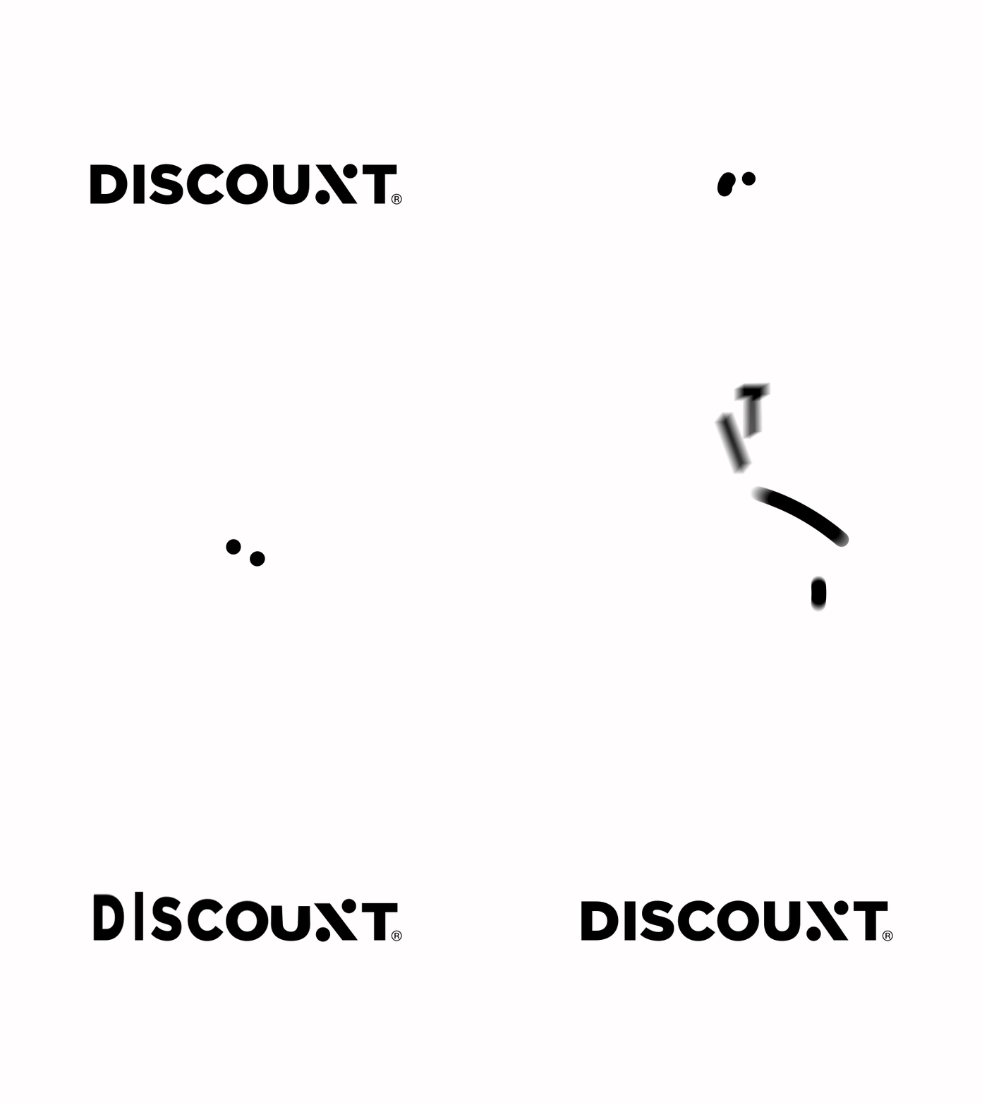
01 – Light Motion Style or Gifs
The use of subtle animations in logos, emails, or app interfaces has become one of the most notable trends. While this trend isn’t entirely new, the evolution it has undergone makes it one of the most distinctive and challenging trends.
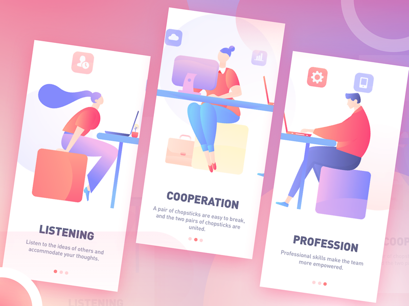
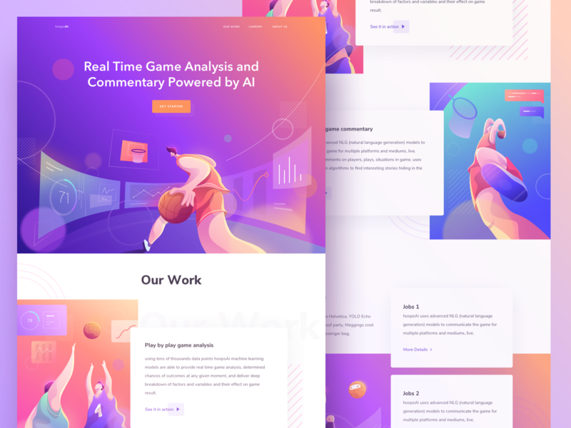
02 – Free 2D Illustration
This trend features illustrations that are not precise or realistic, using bright and lively colors. It’s commonly used in UI/UX design and app tutorials, and sometimes paired with light motion to create a perfect blend of simplicity and creativity.
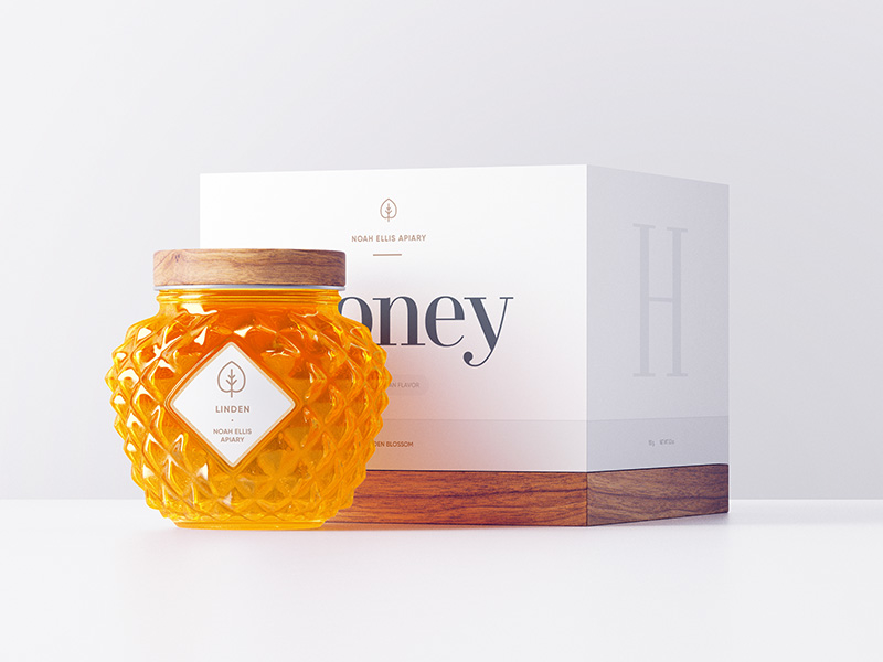
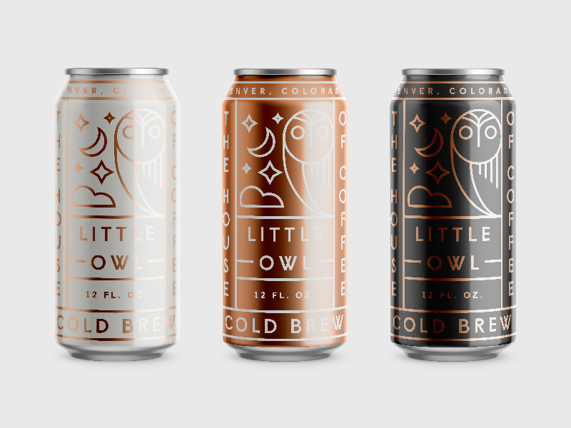
03 – Simple Label Design or Single Color Labels
This trend is mainly used in product packaging like tea and medical products. The focus is on simplicity and clarity, using one or two colors with neatly arranged product information, giving a sense of formality and quality.
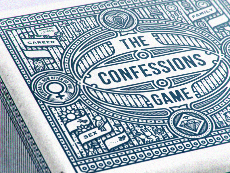
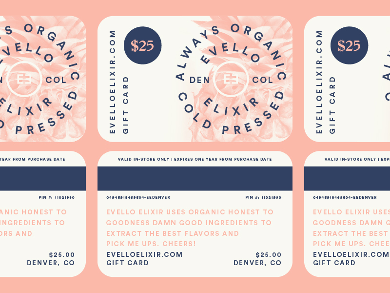
04 – Pattern Style
Pattern design has made a comeback, especially in packaging. It involves the use of repeated patterns on product backgrounds, giving a sense of elegance and distinctiveness. It can be combined with simple label design for unique and attractive packaging.
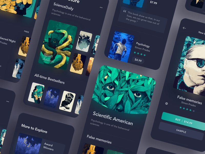
05 – Dark Design
Dark design has gained significant popularity, especially in UI/UX design, partly due to Apple’s adoption of it in their latest OS. It’s a bold and distinctive trend that requires practice and experimentation to master.
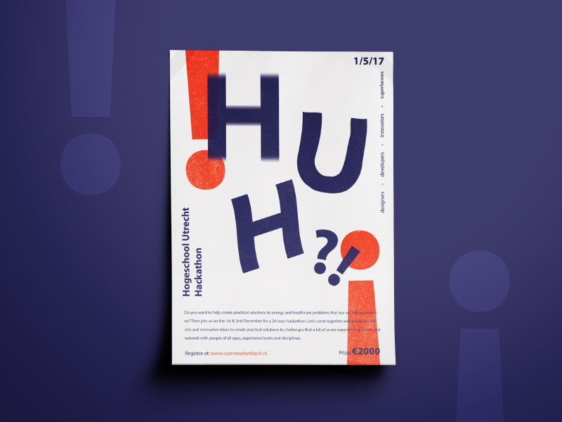
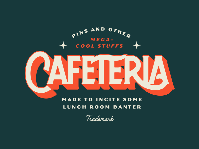
06 – Bold Numbers, Colors, and Letters
This trend is used in designs that require boldness and attraction, such as posters and magazine covers. It involves using bold colors, large letters, and focusing on a specific element in the design.
07 – Single Stroke Design
This trend focuses on using simple, single-colored lines to form the design. It’s characterized by simplicity and elegance and is used in modern icons and logos.
08 – Modern Gradient
Gradients have made a strong comeback, now used in vibrant and neon designs that give a retro ‘80s feel with a modern twist.
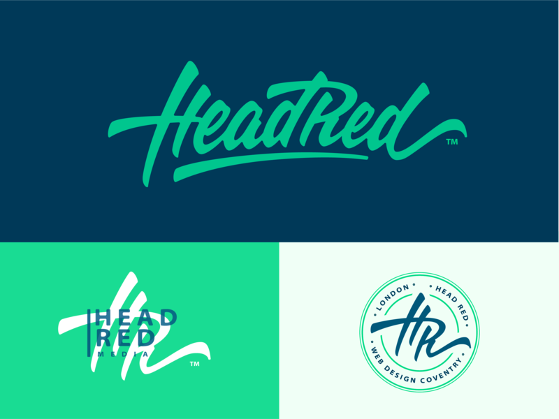
09 – Hand Lettered Design
This trend never really goes away and continues to evolve. It’s widely used in logos and hand-drawn typography, characterized by its randomness and appeal, though it requires skill to perfect.
10 – Vintage Style
Despite being an old trend, vintage design remains attractive. It’s mainly used in product packaging, characterized by faded colors and classic patterns.
In conclusion
I haven’t covered all the design trends, but I highlighted the most popular and widespread ones, in my opinion, which I expect to continue this year or in the near future. Additionally, aligning yourself with modern design trends requires more than just reading an article or two. It demands continuous monitoring of what’s happening around you, a genuine interest in these trends, and also actively experimenting with them.


